
6 Paint Color Trends for 2026, and How to Use Them in Your Home
You open a can of paint.
You make the first stroke on the wall.
You take two steps back.
And immediately, one question crosses your mind:
“Did I just make a mistake?”
The little sample looked beautiful.
So did the photo on Pinterest.
At the store, the color seemed perfect.
But now that it covers part of your wall...
it does not look quite the way you imagined.
That is normal.
Because a color never exists on its own.
It reacts to your lighting.
Your flooring.
Your cabinets.
Your furniture.
Your windows.
The other colors in the room.
Even the time of day.
That is exactly what makes interior color trends interesting...
and sometimes dangerous when you follow them blindly.
In 2026, major paint palettes continue moving away from completely white interiors and some of the cooler grays that dominated homes for years.
Warmer colors are returning.
More natural colors.
Deeper colors.
More enveloping colors.
And sometimes much bolder ones.
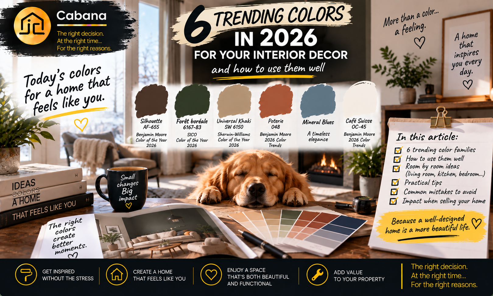
Benjamin Moore selected Silhouette AF-655, a deep espresso brown with charcoal undertones, as its 2026 Color of the Year.
SICO selected Boreal Forest 6167-83, a green inspired by Canada's vast boreal landscape.
Sherwin-Williams chose Universal Khaki SW 6150, a warm, earthy neutral.
Three very different colors.
Yet they essentially tell the same story:
Color is returning to our homes, but with a more mature approach.
So the question is not simply:
“What color is trending in 2026?”
A better question is:
“Which of these trends can actually work in my home?”
Because a color can be beautiful...
and still be completely wrong for your room.
Here are six paint color families trending in 2026, how to use them and, most importantly, how to avoid turning a five-minute crush into something you want to repaint six months later.
1. Espresso and chocolate browns
Let's start with one of the most interesting shifts in 2026.
Dark brown.
Forget the image of dull or dated brown.
Think instead of:
-
espresso;
-
cocoa;
-
chocolate;
-
burnt umber;
-
charcoal brown.
Rich, deep and enveloping colors.
Benjamin Moore's choice of Silhouette AF-655 represents this direction particularly well.
The color combines rich espresso tones with subtle notes of charcoal.
Used properly, the result can be remarkably sophisticated.
These browns work especially well with:
-
natural wood;
-
warm whites;
-
cream;
-
beige;
-
leather;
-
certain metals;
-
textured fabrics.
Imagine an espresso wall behind a wood bookcase.
Cream trim.
A cognac chair.
A brass lamp.
A few natural textiles.
Suddenly, brown does not feel heavy at all.
It feels warm.
Where can you use dark brown?
It can work particularly well in:
-
a dining room;
-
an office;
-
a bedroom;
-
an architectural feature wall;
-
cabinetry;
-
built-in shelving.
But before painting four walls, look at the natural light.
A deep brown in a bright room can feel rich and enveloping.
The same color in a small, dark room can create a completely different result.
That is not necessarily bad.
Sometimes a small room becomes much more interesting when you intentionally embrace its intimate character.
But you need to know what you are trying to create.
Color never exists on its own. Light is part of the color.
2. Forest greens and natural greens
If brown brings the earth into our homes, green brings in the forest.
And in 2026, green continues to play an important role.
But rather than simply talking about “trendy green,” consider what kind of green is actually appearing.
SICO selected Boreal Forest 6167-83 as its Canadian 2026 Color of the Year.
It is a green inspired by Canada's vast boreal forests.
Natural.
Deep.
Calming.
And particularly interesting when paired with organic materials.
Greens work especially well with:
-
wood;
-
stone;
-
beige;
-
cream;
-
brown;
-
certain blues;
-
natural fibers.
Imagine forest green cabinets with a light countertop.
A deep green office with hardwood floors.
A small powder room with green walls, a simple mirror and brass accents.
Green can become a dominant color without necessarily making the entire home feel built around a passing trend.
Where can you use forest green?
Consider it in:
-
an office;
-
a bedroom;
-
a powder room;
-
a library;
-
cabinetry;
-
an accent wall.
If dark green feels too intense for an entire room, use it on a smaller surface.
Because there is a difference between:
loving a color
and
wanting to live inside that color.
You can create a tremendous amount of character with one well-chosen element.
3. Khaki and warm neutrals
You like the new color trends, but the thought of an espresso-brown living room already has you reaching for white paint?
Start here.
Khaki.
Sand.
Warm taupe.
Beige.
Warm greige.
Off-white.
Neutrals are still here.
They are simply becoming warmer.
Universal Khaki SW 6150, selected by Sherwin-Williams as its 2026 Color of the Year, represents this direction particularly well.
It is a mid-tone neutral with a subtle yellow undertone.
Why is this type of color so useful?
Because it can bring warmth into a room without automatically becoming the main character.
The wall becomes the background.
Other elements can do the talking.
A sofa.
Artwork.
Wood.
Natural stone.
A rug.
A bookcase.
Are warm neutrals easier to sell than very dark colors?
Often, a relatively neutral palette requires less imagination from a buyer than an extremely personalized color.
But be careful with the obvious conclusion:
“Then I should paint everything beige before selling.”
Not necessarily.
A home without personality is not automatically more appealing.
And a beautiful dark color that works with the room is not automatically a problem.
The better question is:
Does the color improve the room, or does it become the first thing a buyer wants to change?
Those are two very different things.
That can also depend on the property and its market. A contemporary condo in Brossard, an older home in Saint-Laurent or a property in Saint-Lambert may not have the same materials, natural light or buyer expectations.
A color should help present the room. It should not force buyers to mentally repaint it during the showing.
If you are considering more than paint before listing, my guide to renovating before selling in Quebec and which improvements actually add value can help separate improvements that support the sale from projects that mainly reflect personal taste.
4. Terracotta and clay reds
Terracotta.
Clay.
Brick.
Rust.
Pottery.
These colors naturally continue the move toward warmer, more organic interiors.
Benjamin Moore's 2026 Color Trends palette includes Southwest Pottery 048, for example.
These colors can add substantial warmth without necessarily feeling as heavy as a very dark brown.
They can pair beautifully with:
-
light wood;
-
oak;
-
cream;
-
natural fibers;
-
black;
-
certain greens;
-
stone.
Should you paint the entire room?
Not necessarily.
And that is one of the smartest ways to approach trends.
Terracotta can work on:
-
an accent wall;
-
a dining room;
-
an entryway;
-
cabinetry;
-
a niche;
-
selected furniture.
What if you love the trend but do not want to start painting?
Use it somewhere else.
A vase.
A throw.
Pillows.
Artwork.
Ceramics.
An accent chair.
Not every trend needs to become a wall color.
Sometimes the smartest way to adopt a trend is to make sure you can remove it in five minutes when you have had enough of it.
5. Deep and mineral blues
Blue never really disappeared.
What changes is how we use it.
Instead of thinking only about traditional navy, consider blues that feel:
-
mineral;
-
gray-toned;
-
smoky;
-
deep;
-
slightly green.
They can create particularly interesting contrasts with:
-
wood;
-
off-white;
-
brown;
-
cognac;
-
chrome;
-
nickel;
-
certain earthy tones.
A deep blue can give an office or bedroom a lot of character.
A softer blue may be easier to integrate into a living room or other common area.
But blue is also a perfect example of why you should test paint in your own home.
A blue that looks perfectly balanced in a store may become much cooler under your lighting.
And a blue that looks almost gray in daylight can reveal considerably more color at night.
You are not simply choosing a color. You are choosing how that color will react to your home.
6. Off-whites, creams and light neutrals
After all this brown, green, terracotta and blue...
is white dead?
Absolutely not.
It is evolving.
Very cool whites can make room for softer whites.
Cream.
Ivory.
Off-white.
Slightly warm neutrals.
Benjamin Moore's 2026 palette includes Swiss Coffee OC-45, for example.
These colors become especially useful when creating contrast.
Imagine:
an espresso-brown wall with cream trim;
green cabinetry with off-white walls;
a terracotta wall surrounded by lighter surfaces;
natural wood against a warm neutral.
White no longer needs to be the star.
It can become what allows the other colors to breathe.
Sometimes the best way to make a dark color spectacular is simply to give it the right neutral beside it.
What paint color should you choose for a living room?
Before looking at trends, look at what probably will not change.
Your flooring.
Your fireplace.
Cabinetry visible from the room.
Large furniture you plan to keep.
The amount of natural light.
The direction your windows face.
Those elements already exist.
Your paint needs to live with them.
Not the other way around.
In a bright living room with plenty of natural wood, a green or deep brown can work beautifully.
In a smaller or darker room, a warm neutral may be easier to balance.
Or you may decide to fully embrace the intimate nature of the room with a deeper color.
There is no single perfect color for every living room.
There is a color that works with the elements already present in yours.
What paint color should you choose for a kitchen?
The kitchen requires even more thought.
Why?
Because paint is only one color among many.
You also have:
-
cabinets;
-
countertops;
-
backsplash;
-
flooring;
-
appliances;
-
walls.
And every one of those elements has its own undertones.
That is where a beautiful color can suddenly look completely wrong.
A warm beige may look beautiful by itself and much less convincing beside a very cool countertop.
A green can look spectacular with natural wood and conflict with certain other finishes.
Before choosing a kitchen color, place your sample beside the surfaces that are staying.
Never choose a kitchen color in isolation.
You are not decorating a wall.
You are composing a room.
If your project also involves cabinetry, finishes or a larger kitchen update, see 10 timeless kitchen trends for a modern kitchen that ages well. It looks at the difference between design choices that can age gracefully and choices that may make a kitchen feel dated much sooner.
What paint color should you choose for a bedroom?
A bedroom often allows for more personality.
Why?
Because it does not necessarily need to appeal to everyone.
A deep brown can create an enveloping atmosphere.
A natural green can feel calmer.
A mineral blue can work with several styles.
A warm neutral remains an extremely versatile option.
But do not choose based only on a photograph on your phone.
That beautiful chocolate-brown bedroom you saved may have:
-
an enormous window;
-
a ten-foot ceiling;
-
southern exposure;
-
very light textiles;
-
professional lighting.
Your bedroom may have none of those characteristics.
You can love the inspiration without copying the exact recipe.
Are accent walls still in style?
Yes.
But not automatically.
The famous accent wall does not need to disappear.
It simply needs a reason to exist.
Ask yourself:
Why this wall?
Is it the fireplace wall?
The wall behind the bed?
Built-in shelving?
A niche?
An architectural feature?
The wall your eye naturally moves toward?
An accent wall generally works better when it highlights something.
Choosing a random wall simply because a room “needs an accent wall” can produce exactly the opposite effect.
Color should emphasize the architecture. It should not try to invent architecture that is not there.
The biggest paint mistake: choosing from a tiny sample
You hold a small paint chip.
You love it.
You buy several gallons.
You paint.
And suddenly:
“That is not the same color at all.”
The paint probably did not change.
The context did.
The light.
The surface area.
The surrounding colors.
The time of day.
Artificial lighting.
The amount of color you can now see.
A two-inch sample and a twelve-foot wall simply do not create the same visual experience.
Before making your final decision, test the color in the room where you will actually use it.
And do not look at it only once.
Observe it:
in the morning;
in the afternoon;
at night;
with the lights on.
Place it beside the important surfaces.
Your floor.
Your countertop.
Your cabinets.
Your sofa.
Then leave it there for a few days.
A sample shows you a color. Your home shows you what that color will become.
Should you choose a trendy paint color if you plan to sell soon?
Now we get to the important real estate question.
If you expect to sell within the next few years, should you avoid every strong color?
No.
But think about two things:
permanence
and
the cost of reversing the decision.
Painting a dark brown wall is relatively easy to change.
Installing highly personalized cabinetry in a particular color is a different decision.
Choosing expensive, highly trendy tile is more permanent again.
Ask yourself two questions:
How long will I enjoy this choice?
and
How much will it cost to change if my taste or plans change?
The more expensive and permanent the decision, the less it should depend solely on a trend.
A simple rule can help:
Be bolder with what is easy to change. Be more thoughtful with what is expensive to replace.
Does a new paint color increase your home's value?
Not automatically.
Spending $1,000 painting a room does not mean your house is now worth $1,000 more.
Paint can, however, improve:
-
presentation;
-
perceived brightness;
-
visual consistency;
-
the impression of maintenance;
-
real estate photography.
It can also eliminate a distraction.
Imagine two identical living rooms.
In the first, the buyer walks in and immediately notices the windows, fireplace and size of the room.
In the second, the buyer walks in and thinks:
“Wow. That red is intense. We'd have to repaint this.”
The red wall probably did not destroy the property's value.
But it just occupied mental space that you might have preferred the buyer to give to the fireplace, natural light or room dimensions.
That is the real question.
Does your color help the buyer see the room, or does the buyer see only your color?
Paint can help present a property more effectively.
It does not automatically create an increase in value equal to what you spent.
That distinction between the cost of an improvement and the market value buyers may assign to it matters when preparing a property for sale. My complete guide to selling a house in Quebec for the best price and conditions puts presentation, preparation and pricing into the broader context of the sale.
Should you repaint your entire home before selling?
No.
Sometimes the best decision is to leave the paint alone.
If the walls are clean, consistent and in good condition, repainting the entire house may not be the best use of your money.
Instead, look at:
-
extremely personalized colors;
-
damaged walls;
-
obvious touch-ups;
-
rooms that feel unnecessarily dark;
-
colors that clash with permanent finishes;
-
areas where the paint makes the home appear poorly maintained.
Then compare that expense with other work the property may need.
Because a house with fresh paint and an obvious maintenance problem is still a house with an obvious maintenance problem.
Before improving the decor, make sure the house is not asking you to address something more important.
If several projects are competing for the same budget, my guide to renovating a house in Quebec, what to do first, how much to budget and how to avoid costly mistakes can help put those priorities in the right order.
Do dark colors always make a room look smaller?
Not necessarily.
This is one of those decorating rules that deserves much more nuance.
A dark color can affect how you perceive a room.
But the result also depends on:
-
natural light;
-
artificial lighting;
-
contrast;
-
ceiling height;
-
furniture;
-
trim;
-
continuity with adjoining rooms.
A small, dark room therefore does not automatically need to be painted white.
Sometimes trying to make a naturally dark room feel artificially “bright” with white paint does not create the result you expected.
Embracing its character with a deeper color can be much more interesting.
But do it intentionally.
Not simply because you liked a photograph on social media.
6 questions to ask before choosing your paint color
Before buying the paint, ask yourself:
-
How much natural light does this room receive?
-
Which permanent elements need to work with this color?
-
Do I actually love this color, or do I simply love the photograph where I saw it?
-
Would I still be comfortable with this choice three years from now?
-
If I sell, does this color improve the presentation or become a distraction?
-
Have I tested the color in my own room before making the decision?
That final question could save you several hours of work...
and a few gallons of paint you wish you had never purchased.
Trends should inspire you, not make the decision for you
Silhouette.
Boreal Forest.
Universal Khaki.
Terracotta.
Mineral blues.
Warm whites.
The 2026 color trends offer far more possibilities than an entirely white or gray interior.
Enjoy them.
Experiment.
Add personality.
But remember one thing:
Your home is not a catalog page.
The lighting is different.
The floors are different.
The furniture is different.
The dimensions are different.
The way you live is different.
And most importantly, your taste is your own.
The best trendy color is not necessarily the one everyone else is using.
It is the one that works with your home, that you genuinely enjoy and that you will still be happy to see when the next “Color of the Year” is announced.
And if you are thinking about selling soon, simply add another dimension to the decision.
Do not ask only:
“Do I like this color?”
Also ask:
“Does it help this room show its full potential?”
Because in decorating, just like in real estate, following a trend is easy.
Understanding when that trend actually works for your home requires a little more thought.
And sometimes the best decorating decision is not choosing the trendiest color.
It is choosing the one that looks as though it has always belonged in your home.
The right decision. At the right time... For the right reasons.
Jonathan Cabana
Residential and Commercial Real Estate Broker
eXp Québec
Greater Montreal | South Shore
(514) 476-0730